See Stories
Taking a website from an "About Us" page to a community resource
See Stories is a non-profit based in Alaska that provides workshops for youth and educators for filmmaking, podcasts. They're an important part of their community and empower young people to document and tell their stories. Our team worked with See Stories as part of SVC's UX certificate program.
We designed a website that furthered the client's mission. I led on creating interactions that made See Stories's content a resource for educators.
My Role
- Interaction design
- Prototyping
- Client Presentation
The Team's Role
- User Research
- Information Architecture
- Usability Testing
Duration
3 months
Summary
The Challenge
See Stories is a community resource, its website is not
See Stories has an incredible mission, but their current website didn't tell their story well. It didn't have a clear donation user flow and a lot of their content was hard to find or not viewable.
How could we make See Stories's website a valuable resource for their users?
The Solution
Make it more than just an "About Us" page
Reorganizing the site for users was the first priority, but we knew it wouldn't be enough. Using insights from our research we designed interactions and pages to turn the content on the site into a resource and make it more valuable for educators.
The Outcome
An easy to use website with features that solved problems for users
Our high-fidelity prototype not only wowed the client, but it got good usabilty scores and feedback in our usability tests. One of my main deliverables was interactions for the workshop and video pages that enabled educators to reuse See Stories's videos in their lesson plans.
"I really like the video page, it has all the information I would need especially if I’m a teacher."
-Test Participant 1
Research
Identifying the needs for three very different users
Educators, Students & Donors
We researched three user groups – Educators, Students, and Donors – since all of them would have specific needs. Our insights centered around what each user would need the site to do for them.
Affinity map of the interviews with Educators and Students

Educators
- Easily vet the organization
- Find content by educational categories
- Use videos & workshops in lesson plans
- Sign up for workshops

Students
- Sort videos by topic
- Sign up for workshops
- View past workshops & student work

Donors
- Learn the mission of the org
- Clear & easy ways to donate
- A way to build a lasting relationship with the org
For Educators and Students we did interviews to get good, qualitative insights into what they wanted from the site. For Donors we used a survey to get quantitative data on how people decided to donate to a non-profit.
After we gathered our insights, we focused on three goals to guide our ideas, communicate the story, showcase the work of See Stories, and to find a way to for educators to easily use See Stories content in their lesson plans.
Our Goals:
- Communicate the Story.
- Showcase the Work.
- Make content into Lesson Plans.
Building the new site
Ideas & Solutions
Taking insights from users to design solutions to their problems
Rethinking the site's information architecture & navigation
Users said they had a hard time finding what they needed, so we built the site's new IA by conducting a content audit & organizing similar content into categories.
The pages and subpages of the sitemap were all created using the categories we created. Our idea was that a page for each specific category would be easier for users.
To validate our new sitemap we ran tree test to ensure it fit our users' needs. The test yielded a 89% task completion, giving us confidence that we had designed a good sitemap for our users.
Tree Test Results
89%
Task Success Rate
78%
Directness
Final site map
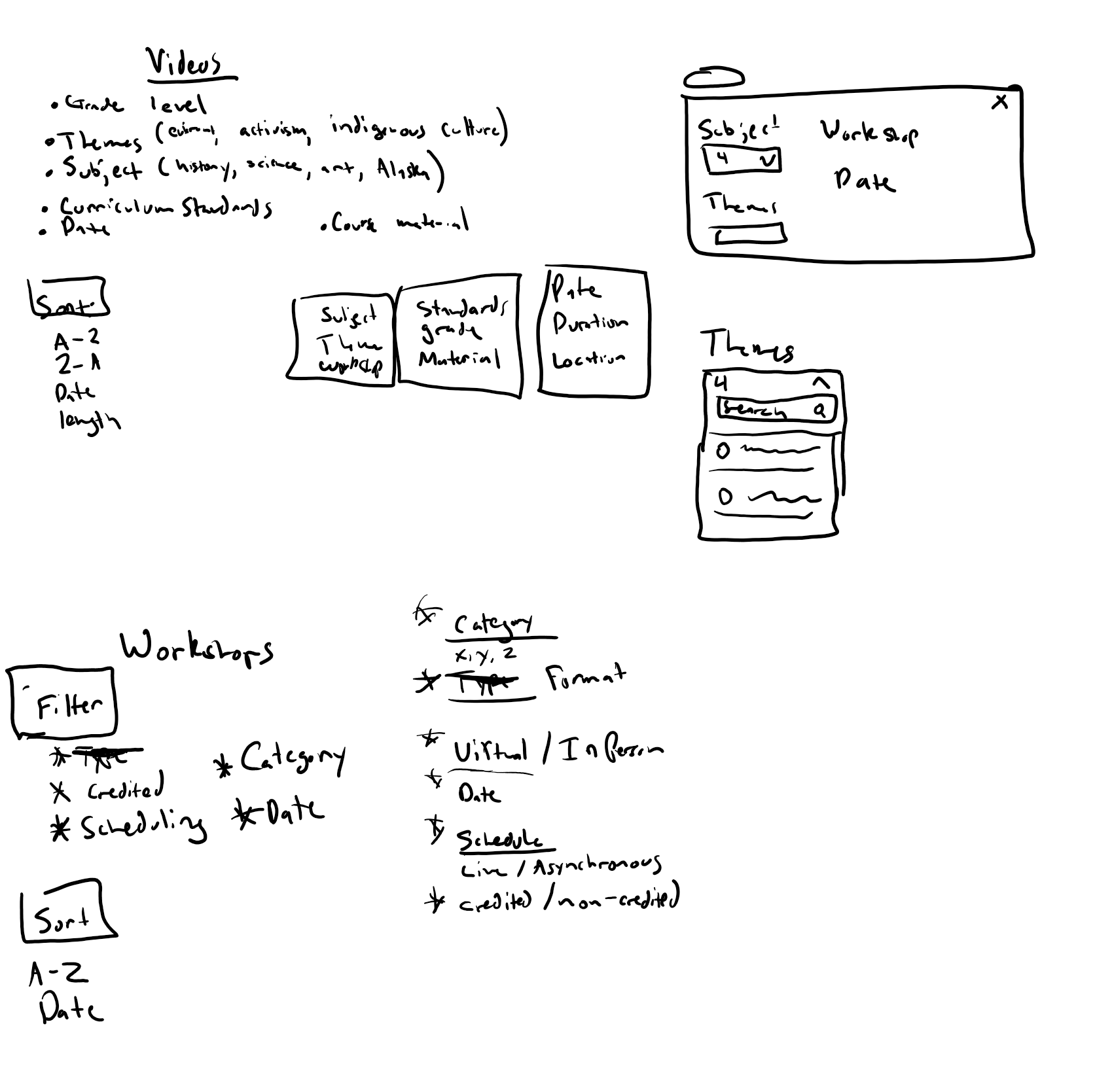
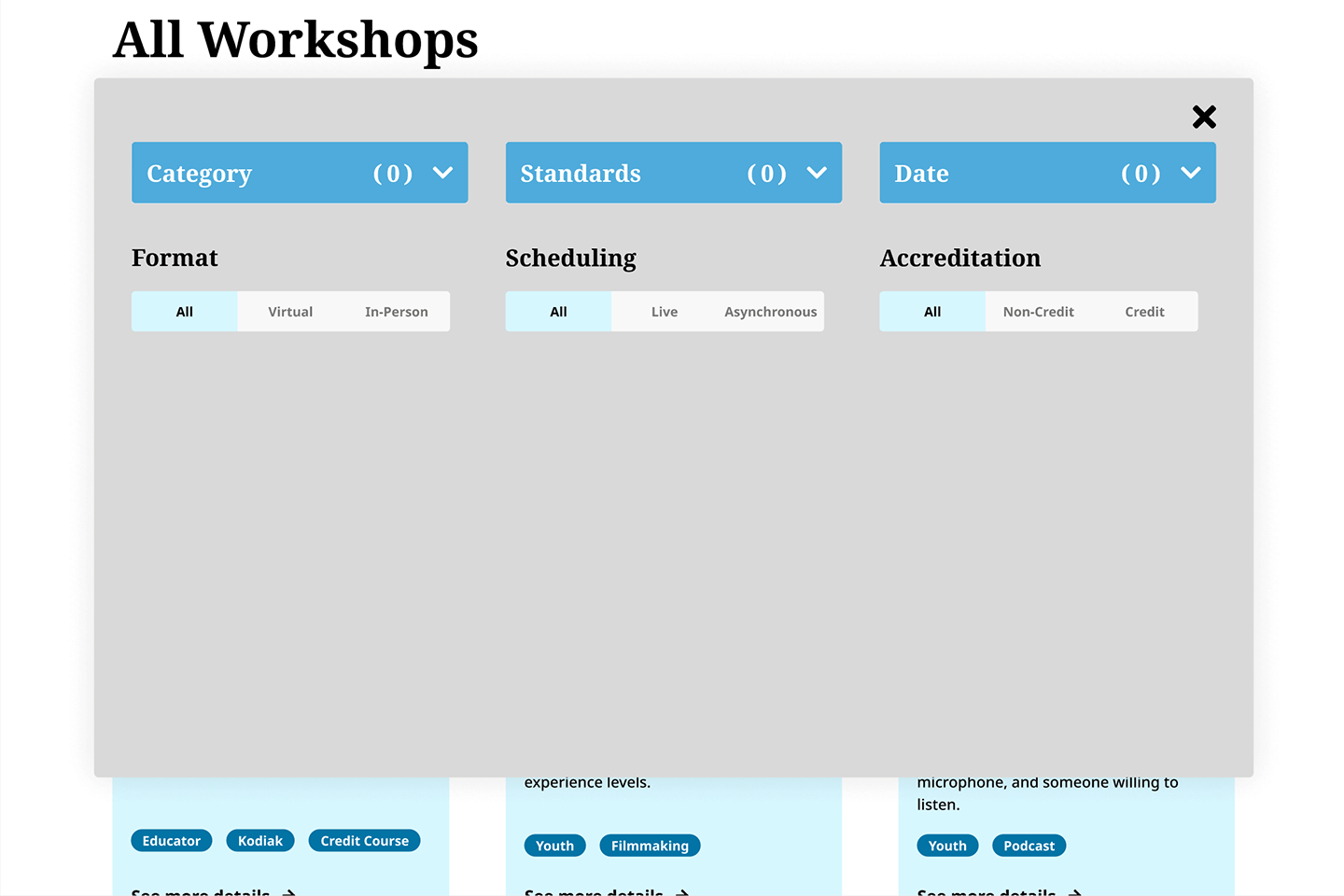
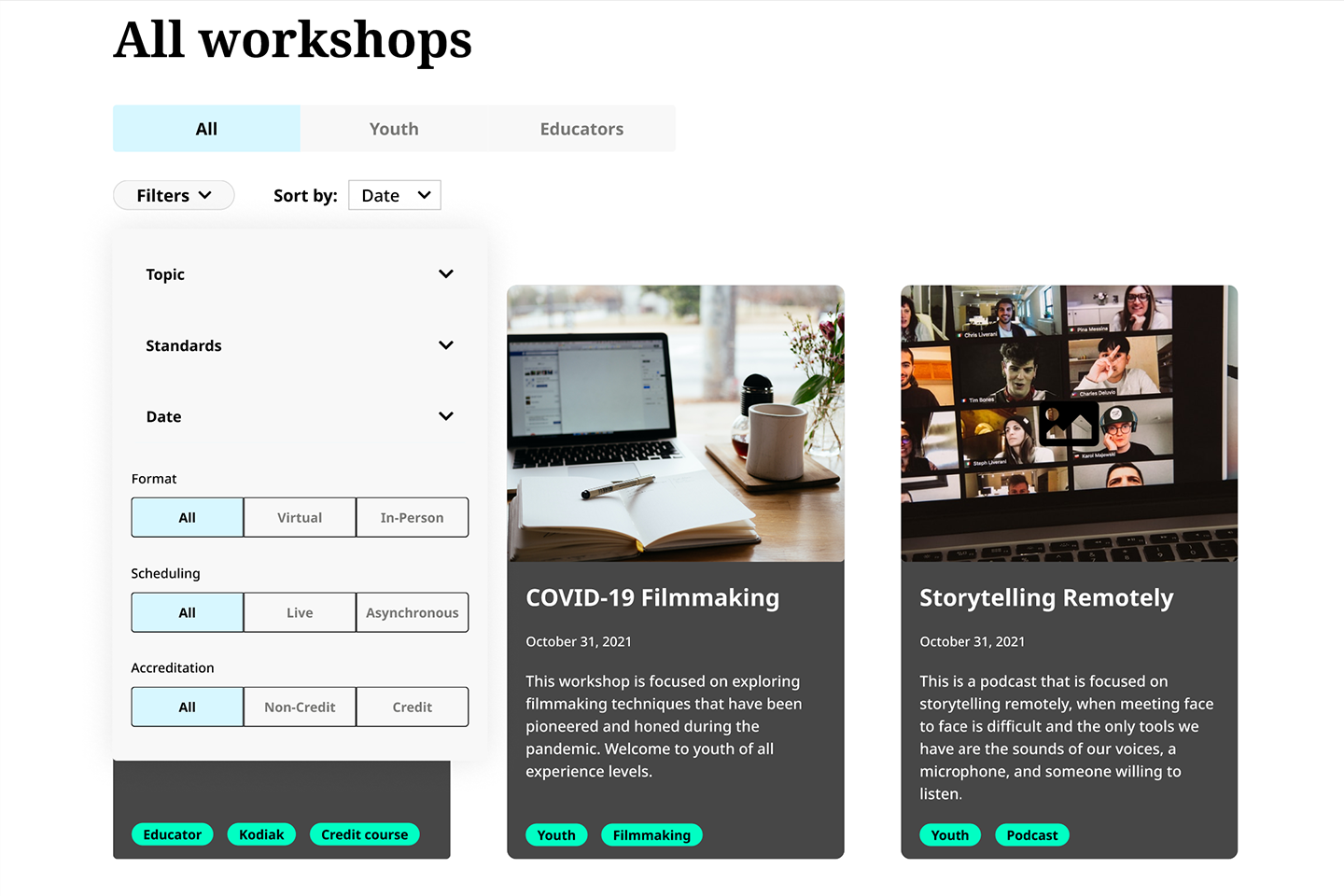
Sketches of Filters
First iteration of Filters
Filters to help users sort through lots & lots of content
Educators needed to find specific videos for their lesson plans, so I designed filters based on educational categories – such as subject, grade level, etc – to help users sort through content.
See Stories had so much content that I knew there would be a need to filter content on the pages, especially as they added more in the future. Search was not discoverable enough unless users had a specific topic already in mind. Filters could guide users based on the categories and other inputs that were provided on the site.
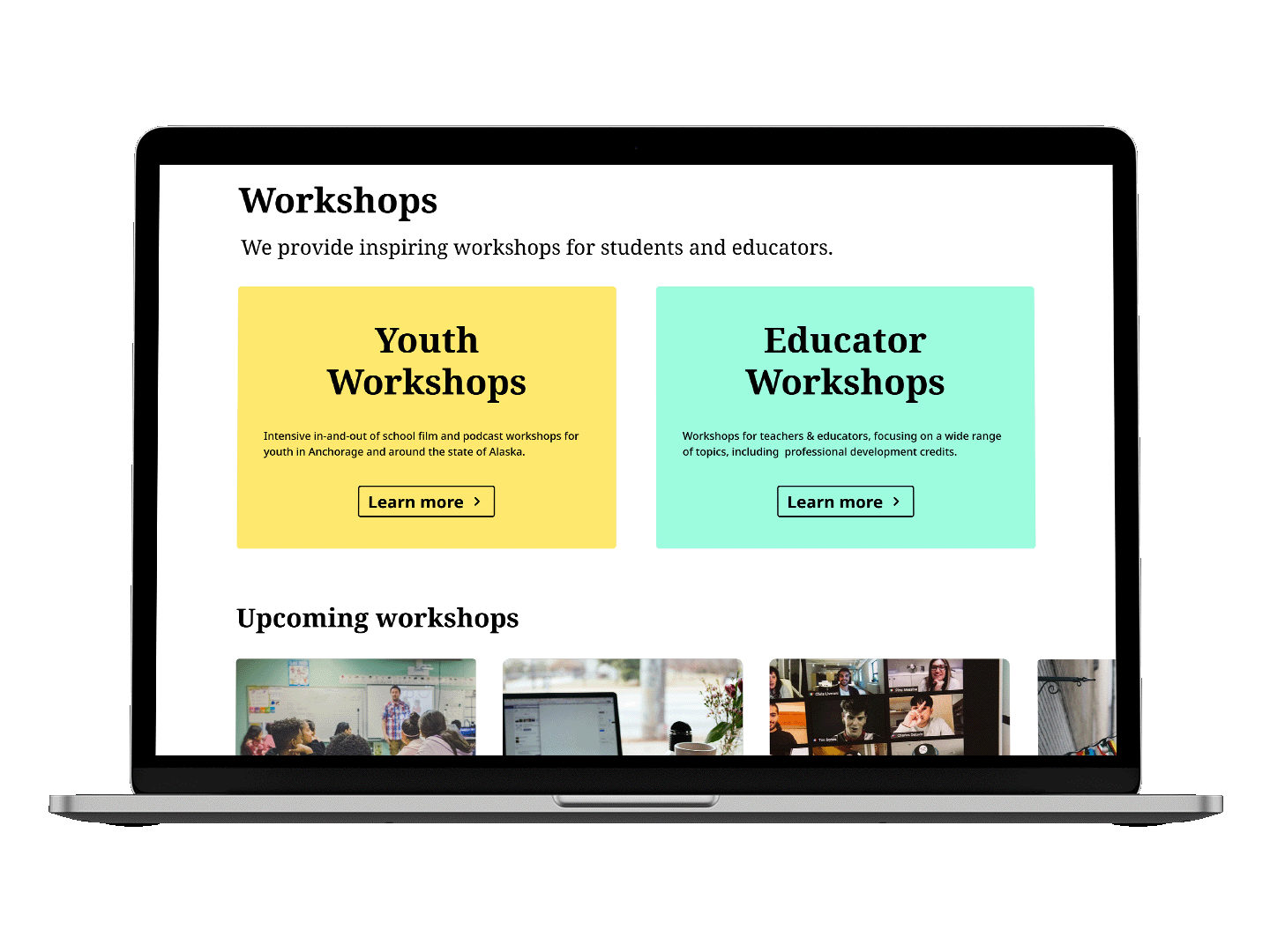
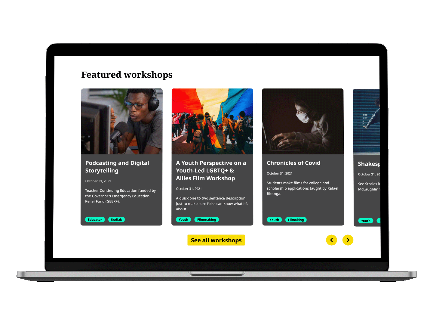
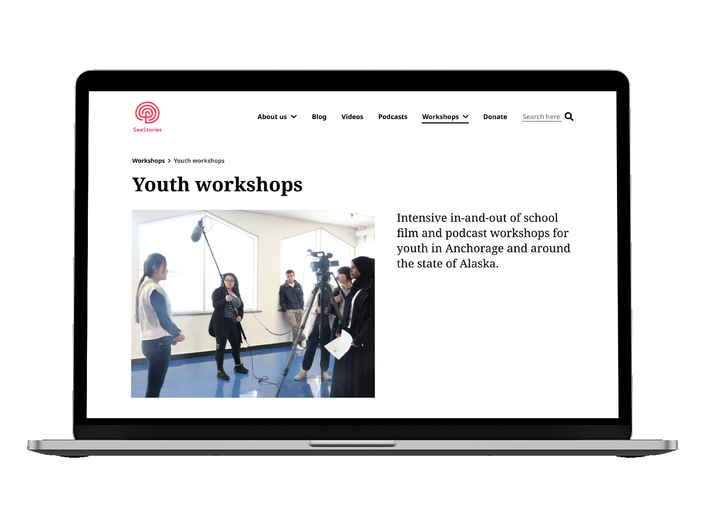
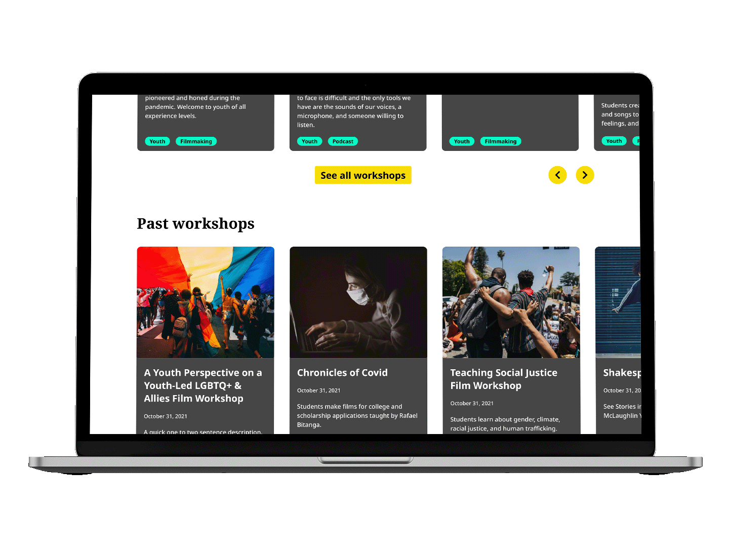
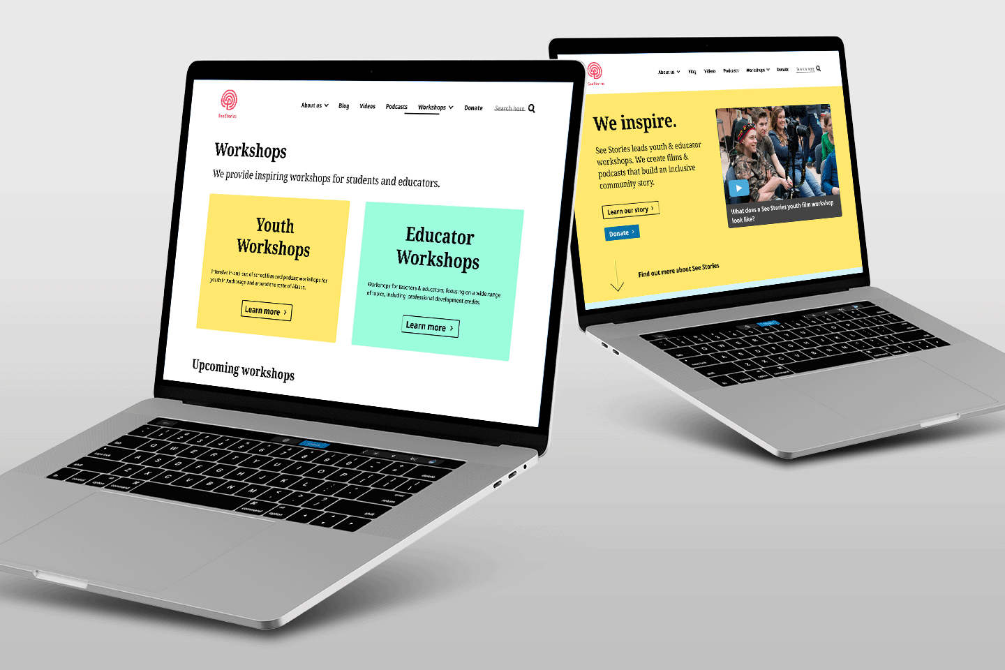
A dedicated space for workshops to make it easy to register & learn
The old site had no dedicated place for workshops and users cited this as a need, so I designed dedicated workshop pages to help discoverability for this important content.
On the main page I designed swimlanes to highlight future and featured workshops so See Stories & users could find them ones more easily. I also designed filters to sort by categories, types, and by student or educators so both users could find the workshop they needed. Finally I added a registration button to make it simple for anyone to register once they'd found the workshop they were looking for.
Final iteration of Workshop pages
Let's see what we can improve on
Usability tests highlighted what needed improved on filters & site copy
Using the feedback we made changes to the filters, the visual look/feel, and some of the copy on the site. Despite these changes, we also got positive feedback on the design and all 8 participants were able to complete the tasks in the test.
"Signing up for the workshops is a very smooth path, very straightforward"
-Test Participant 3
"I think using the cards to show videos, initiatives, podcasts is a really nice way to organize the content"
-Test Participant 2
Flow for Registering for a Workshop
Before / After of Filters
Filters needed a new layout
Users stated that the design took up too much of the screen, so I made a new iteration that solved that issue and simplified the presentation.
"I think usually the issue I’ve had with websites is filters, it can be overwhelming when there’s so many options"
-Test Participant
Some copy was confusing & failing to communicate the story properly
We changed some copy & created recommendations for the client since users pointed out that some copy & terminology See Stories provided was not clear to users. One notable example was the Donate page, where we added more benefits & edited it for clarity.
"I don't know the definition of asynchronous"
-Test Participant
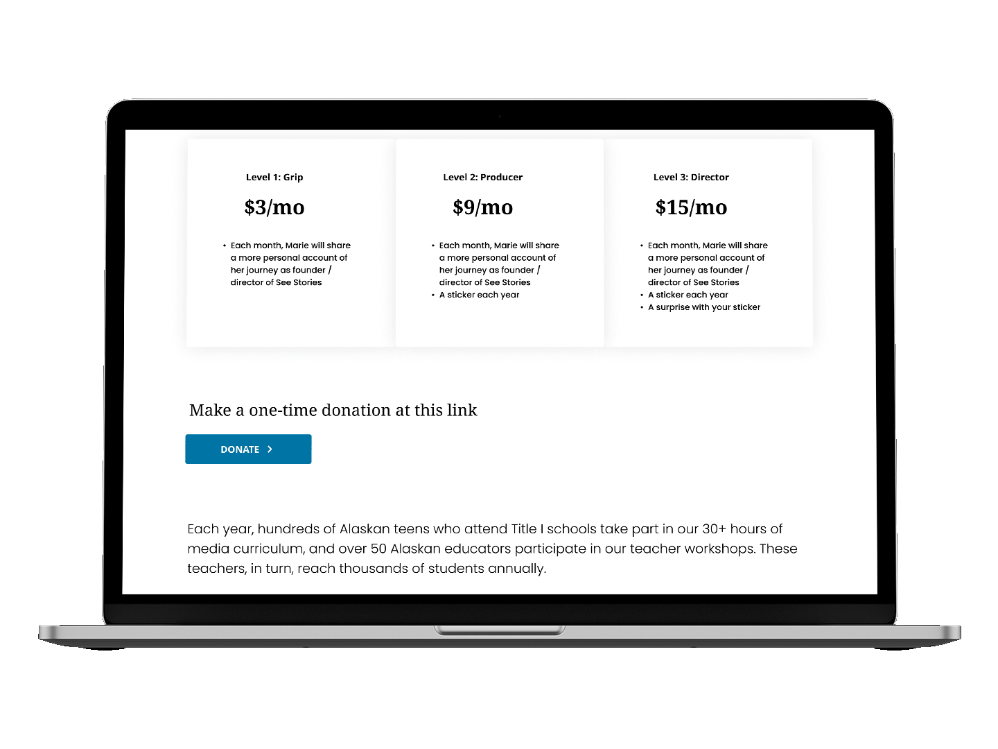
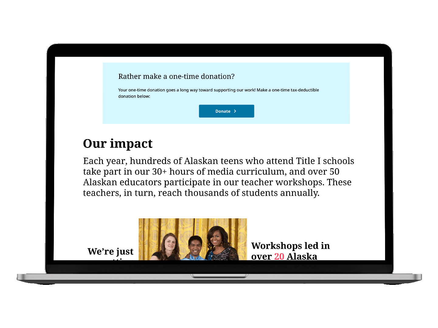
Before / After of new copy on Donate page
Updated Prototype
In addition to the other changes, we also updated the visual look/feel to prepare for the client presentation
Results, Next Steps & Learnings
A complete high-fidelity prototype, a new visual identity, & the recommendation to revise the site copy conduct another round of usability testing.
We presented the prototype to the client who was overjoyed with the end result. Their plan was to take our design and recommendations to their web developer to begin building.
"Thank you guys so much, is it weird that I want to cry?"
-Marie, See Stories Founder
I learned a lot working on this project, namely how to take insights and turn them into solutions for users and how to adjust to a client's changing needs and brief. Next time I would spend some extra time on my interaction designs to make sure the best solution was going through usability testing.
Thanks for checking me out! If you'd love to collaborate drop me a line
Skills & Services
- Motion Design
- UX Design
- Branding & Strategy
- Art Direction
- Videography
- Photography
Selected Clients
- Publicis Groupe
- Heineken
- BLKRCK Creative
- See Stories